Dominaria has been released and people have had the opportunity to live with the cards for a little while. I wanted to take a few moments to reflect on the work that went into the art for the set and share some thoughts about it from the perspective as the art director.
First thing's first—I want to thank Kelly Digges, Tyler Jacobson, Ethan Fleischer, Dave Humphries, and James Arnold for being incredible partners on this project. Putting a card set together is a huge amount of work and these are the people who put up with me the most. Thanks gang, I hope it was worth my constant nagging.
The following is from my perspective and doesn't discount the incredible efforts of everyone involved, especially Kelly. There was a ton synergy between us; so if I claim I came up with an idea, it was probably only from an excited spur of the moment brain-storming session with Kelly; or an idea got me excited and I ran with it, spun it off in a slightly different direction, and thought it my own. In the end, the most fun I had while developing the set was the free-wheeling ideas from everyone involved. So, I had some ideas, Kelly had some ideas, we tossed them in a blender and viola. Dominaria. I don't want to make it sound like all the images on cards were all me, or anything close to that. There was a great team involved and I don’t want to undersell anyone's involvement.
Before I get started in earnest, I want to describe what, until recently, I thought art directing was: writers would come up with art descriptions. I would find an appropriate artist to handle the assignment. I made sure the artist delivered a quality piece that adhered to the world guide, and then made sure the artists all got paid in a timely manner. Done. Seems pretty straight forward.
The following is a long-winded tour on why the above statement is false…
As an art director, the first set I was responsible for was Aether Revolt, followed by Amonkhet. Jeremy Jarvis was the sole art director for Magic: The Gathering for almost a decade. About the time of my hiring, he received a promotion out of day-to-day art directing. Even though I was the art lead on those two sets, I wasn't really involved in their worldbuilding. That was something handled by Jeremy before I came on board. So, while I was following through on his work as best I could, Jeremy and I are different people and would have made different decisions. While working on those sets, I had concerns that I wasn't executing in a way Jeremy would have been happy with. Not that I was worried Jeremy would be unhappy with my work—but I was playing in his sandbox so to speak, and wanted to do his work justice in his way.
I was eager to get in on the ground floor of a new set and see if things would be different if I were responsible for the entire thing from the get-go.
Before taking on Dominaria, I was actually supposed to be the art lead on Ixalan—at the time referred to as Age of Exploration World. When I was hired, Ixalan was the next in the rotation to assign. Cynthia Sheppard, who they hired a few months later, was slated to take the next, which would have been Dominaria. While we were outside smoking (all the ADs smoked at the time), I asked Cynthia if she would be interested in swapping sets. While I loved the hell out of Howard Pyle and paintings of boats, I wasn't all that interested in pirates or dinosaurs. She liked the idea, and I got it cleared by my manager. For the record, Cyn doesn't remember this taking place, but I assure you it did.
Preparing for the Concept Push
An art lead's first immediate goal when developing a setting is to have a successful Concept Push. A Concept Push is when we bring in some of the most talented artists from around the world for a few weeks to help us build our worlds with pictures. In order to have a successful Concept Push, an art lead first needs to make a Concept Push Document, which encapsulates what the art directors intentions are with the set. For instance: Amonkhet is Magic's take on Egypt at the height of its civilization, it is not Indiana Jones archaeology world—so don't paint that. The document talks about the various cultures the creative team is working on for the setting, calls out specific creature types and classes that will be needed, etc. This handout sits with the artists while they are drawing, serves as a reference point, and keeps everyone pointed in the same direction. All my actions until the day the Concept Push started would be to make the clearest, most comprehensive Concept Push Document I possibly could.
I played a bit of Magic in my senior year of high school. I was mostly a comic book dork, but friends of mine were into it and I joined; it made me feel included. I enjoyed the game well enough, but my friends were way better at it than I was. It didn't matter though—I loved the art so I put up with all the losing pretty well. I lost touch with Magic during my college years so my understanding of lore was pretty patchy.
I needed to get a better handle on Dominaria so I started reading the novels. I read them all, from The Thran (I know, technically not the first, but shush you) all the way through Invasion in a span of about nine months. I read at home on weekends and at nights. I was looking for immersion in the subject matter; I didn't try to track specific plots or events. I didn't need to follow specific characters and their motivations. I just wanted to be surrounded in the flavor of the universe as it was presented. There were a few books that I found I read at a slower pace and with greater care, a sign that I was invested in what I was reading. I tracked anything I found that piqued my interest.
One thing I learned was that there was very little magic happening in an IP called Magic, but I digress…
Of course I looked at art. All of the art. Every single card that took place on Dominaria and Rath. Again, I was aiming for immersion in the world and still not interested in memorizing every detail of every card. I was watching the evolution of the world through the artwork. I saw different artists add to the world of Dominaria in different ways, but I didn't track anything specific.
I also found and studied a number of the old world guides. I actually had to reassemble some of them from files found on old CD-Rom back ups. Luckily, my computer at the time still had a drive to read them! I had to convert old Quark X-Press files into current InDesign files. Finding and repairing broken art links was sometimes a fun, grindy distraction from the regular work I did at the time. We also found some old documents and time lines by Pete Venters that had to be digitized and reformatted. It was intern level work, but again, I didn't mind as a distraction from higher level work.
The reading and the art researching was all done over the course of set development. I didn't stop until I started commissioning the art. I consumed it as chronologically as I could, but it took no time at all to find out that Dominaria had been left an apocalyptic wasteland... which really, really bothered me...
Themes for Dominaria
Kelly Digges was the creative lead on the set, and I began engaging with him about his thoughts on the setting. Kelly is deep into Dominaria. He's a proper Vorthos. He knows all the proper nouns involved with story and all the verbs that went along with them. When I asked him what Dominaria was going to be about, there were a lot of ideas: Raven Man this, Keldon's Twilight that, something-something etc. None of which I really cared about. Important? Probably. But I didn't really have anything to offer on that front. It was what I considered to be very noodle-y information—just random strings of thought piled on top of each other. I think with my brain sorta like I sketch out a drawing: I start with the big broad shapes and then get more and more specific as I go. Sorta how Michelangelo explains his sculpting process, or something. I struggle building something large and cohesive out of lots of unrelated bits, I was looking for the larger ideas as a starting place.
There was a meeting where Kelly drew a large diagram on a whiteboard of a bunch of cultures that could be featured on Dominaria. He was determining whether those cultures were wanting to dig up old artifacts or if they wanted to keep them buried. It was probably important information that had to be figured out before he could proceed, but I had nothing to add to that meeting. Kelly was the creative lead for Dominaria. I was just the one making the pictures... right? Well, I did not want an entire block in an apocalyptic wasteland, which was still bothering me, so I started there.
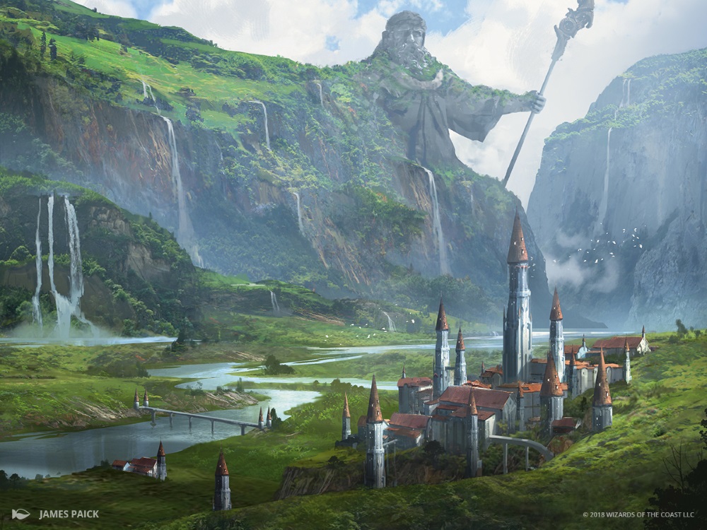
I squirreled away and did some sketches, trying to capture some of the sense of wonder that I remembered when I was playing the game back in the day, and from reading the books, and looking at the cards. I wanted to capture that sense of strange-ness—a world where you could find a mysterious alien portal in cave built by some long-dead advanced civilization, a world of powerful ancient artifacts. I settled on one image that I kind of liked, which depicted a knight who stood in tall grass dotted with bright blue and white blossoms. Nearby was a large, spherical, machine-like artifact, its function unknown, and looming in the distance Urza's tower sat on the far horizon. I presented this to Kelly as "Springtime on Dominaria." He seemed intrigued. We didn't have an answer for what happened with the time rifts or why the world was now lush, but it was something we could figure out later. I was thrilled that I had ideas I could anchor to: old artifacts and springtime.
Kelly and I had been talking a lot about out mutual love for early Magic lore and we came to conclusion that ret-conning anything would be off the table (as much as is possible). We wanted to embrace what the world was, warts and all. That felt like a meaningful goal to me and I latched on to it. I began exploring how to bake that into the art. Obviously, we could use callbacks in the art, but that felt a little flaccid. I wanted to find a way to say, "We also love classic Magic," with the pictures.
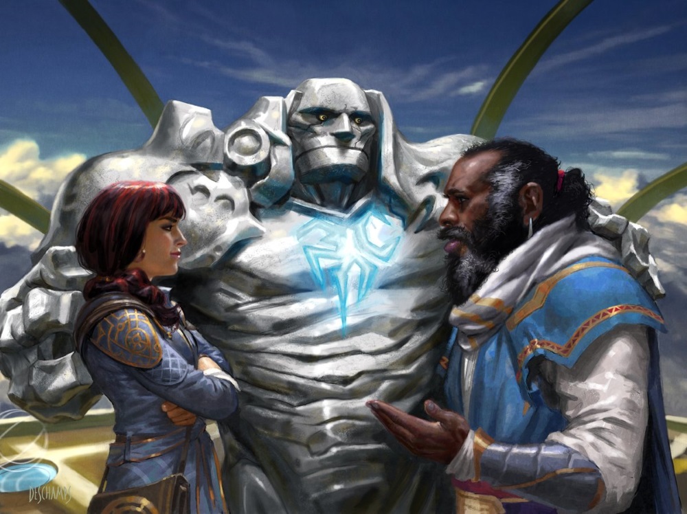
Ethan and Kelly were talking about buried artifacts, but stuff buried in the ground is hard to sell on cards, so I wanted to try to bring some of that ancient-ness into view. I loved how the dragon engines were described in The Brothers' War novel, but didn't love the depictions on the cards. I never got that sense of scale. So I tried to make paintings of giant machine creatures which dominated the landscape—but it didn't quite work. I didn't get the scale I wanted. I tried scale birds—nope. I tried scale knight on horseback—better, but nope. I tried a scale castle—well that's something. Of course the actual scale was totally wrong but it gave me some goosebumps. A castle being overshadowed by this massive structure. The idea that society was living in the shadow of its past became a thing. Sam Burley, an excellent landscape painter, jumped in to help deliver images that could be used to communicate the idea of springtime and the living in the shadows of the past to other team members.
Kelly was able to clarify the themes as Deep History and Vibrant Renewal. With that clarification, I had a lens with which to evaluate our decisions on the set. Kelly applied the theme of history to each color: White reveres the past, Black exploits the past, Red reforges the past, etc. When I saw that my heart soared. That was the moment I felt like we were truly on to SOMETHING.
The Map and Being a Cowboy
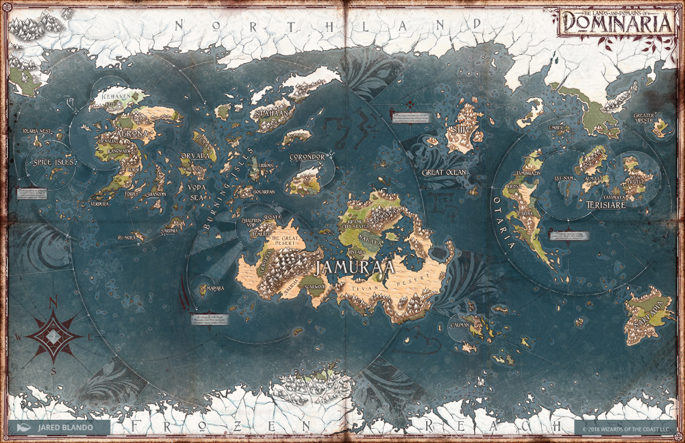
Dominaria Map by Jared Blando
In the meantime, there was the idea of making a map. Ethan claims the map is his brainchild—I would've sworn it was mine—haha. Admittedly, he did the more than the lion's share of the work on it—it wouldn't exist without his efforts. I do remember at the time that it was something no one wanted because maps were an Ixalan thing and no one wanted Dominaria to squat on that space. We proceeded anyways, hoping that eventually the work would get a green light. I roped in Nick Bartoletti, a 3D modeler in another department, and asked if he could photograph Pete Venters's globe (which lived on Kelly's desk), stitch it together in 3D, unwrap it, flatten it and deliver a vectorized file we could edit. Turns out he could. The vector file was handed to Ethan who then proceeded to do god's work.
I was pretty cavalier about the map. I was going to cowboy that stuff and hope it worked out in the end. And that was true about a lot of what Kelly and I did on the creative side of things. I was in a place that I stopped asking for so much permission. Jeremy Jarvis, who for the longest time was Magic's sole vision holder, was promoted up to the third floor and wasn't around for me to ask how he would have done things. Besides, he had better things to think about. So, by default, I did things based on my own judgment and rarely asked if it was okay. It wasn't a, "Screw it!" attitude—it was a, "These things NEED to exist,' sort of mentality, and I was responsible for making those things. It was liberating, but also terrifying. If people hated it, then it was all on me.
I kept talking about the map to various members of various departments until it became a known quantity, and then an expectation. It was easier to ask for budget when everyone thought it was a done deal. That may have been the cowardly way of going about it. I should have made a case, presented it, and argued the merits; but I was still figuring out how to will things into being and I really, really wanted that thing to exist.
Kelly Is Greedy
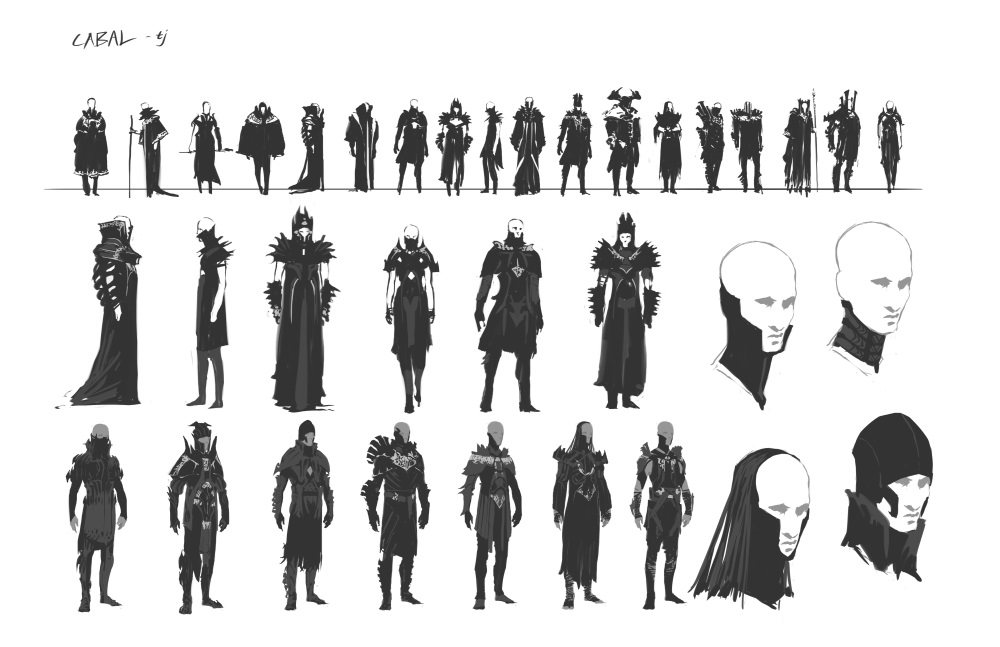
Cabal concept thumbnails by Tyler Jacobson
Kelly was rapidly settling on the cultures involved in the setting. There was a lot of excitement about going back to the basics with Dominaria. Mono-colors were a jumping off point. We could lean into the identity of each part of the color pie. White equals good guys, black is just plain evil, etc. It had been a while since Magic had embraced that core identity. That was kind of exciting to me. I got to make straight up evil-ass villains.
But Kelly wanted a couple cultures in each color. Ten cultures is automatically Ravnica-sized, which is HUGE. I had to figure out how to make that much content with the resources available to me. I would have to min-max in order to develop that much content and do it all well. I did what I could to set ourselves up for success, but I wouldn't really know if we bit off more than we could chew until we started eating. It was impossible for me to know without the hindsight of time. A lot of my job was being tactical with the schedule and telling Kelly Digges, "NO." Ideas are cheap and easy. Painting stuff takes time and costs money.
The Weatherlight
Tyler Jacobson joined the art team as a concept artist and eventually took over as lead concept artist for Dominaria, which was awesome because I had the Weatherlight on my mind. I had The Art of Magic: The Gathering—The Rath Cycle book and I LOVED that thing. The more I considered it the more I loved the idea of bringing that skyship back. It hit the Renewal and History themes right off the bat. It could be a set piece where characters new and old interacted. It would be a way to tour Dominaria. There was NOT universal love for the Weatherlight. The Weatherlight Saga seemed to be very divisive as to what brings older players the positive nostalgia feels. It was another instance where I would ask forgiveness instead of permission. At the time there wasn't any assurance that a Vehicle card would make it into the set.

Weatherlight concept sketch by Tyler Jacobson
Tyler proceeded to develop a series of sketches, none of which resonated with me. I've never been much for industrial design—I don't really know boats—so I couldn't speak in those terms. But I do know Tyler pretty well and I used our mutual appreciation for Star Trek. I simply told him I wanted the 1701-A, not the 1701-D. He got it. He went back and did just one more sketch, and I knew we had it.
There was a wall where we hung artwork, new and old, of what we thought would occupy the return to Dominaria. We added Tyler's new Weatherlight design in the hopes of receiving feedback on the direction. One morning I received that feedback in the form of a long high pitched squeal that emanated from Ethan Fleischer. I could tell it was Ethan because the man is a giant and I could see him over the wall. Honestly, if something like a new image of the Weatherlight doesn't make someone like Ethan have an emotional reaction, then we have no win-condition with the set.
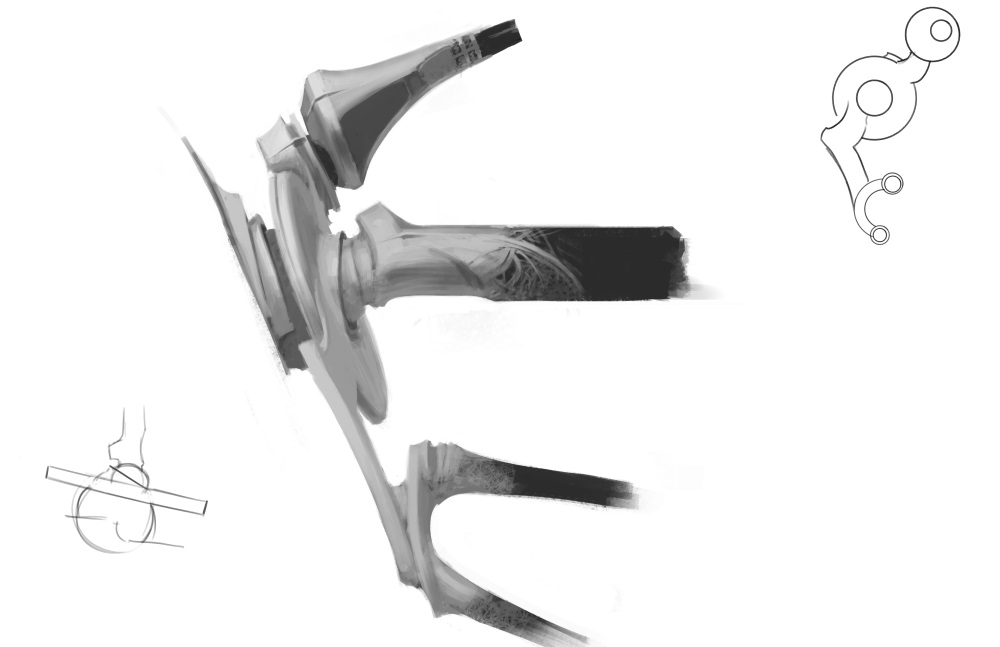
Weatherlight gimbal system concept by Tyler Jacobson
I once again tapped Nick Bartoletti for his assistance, this time on the Weatherlight. I wanted an accurate 3D model of the skyship that I could send to all the artists painting it so it would be 100% consistent. Tyler and Nick worked for months on the vehicle and did some truly exceptional work—even the gimbal system that controls the wings is beautiful and thoughtful.
The Weatherlight's inclusion in the actual set would be an argument to be had another day, but for now we just wanted it to exist.
Redefining the Cultures Before the Concept Push
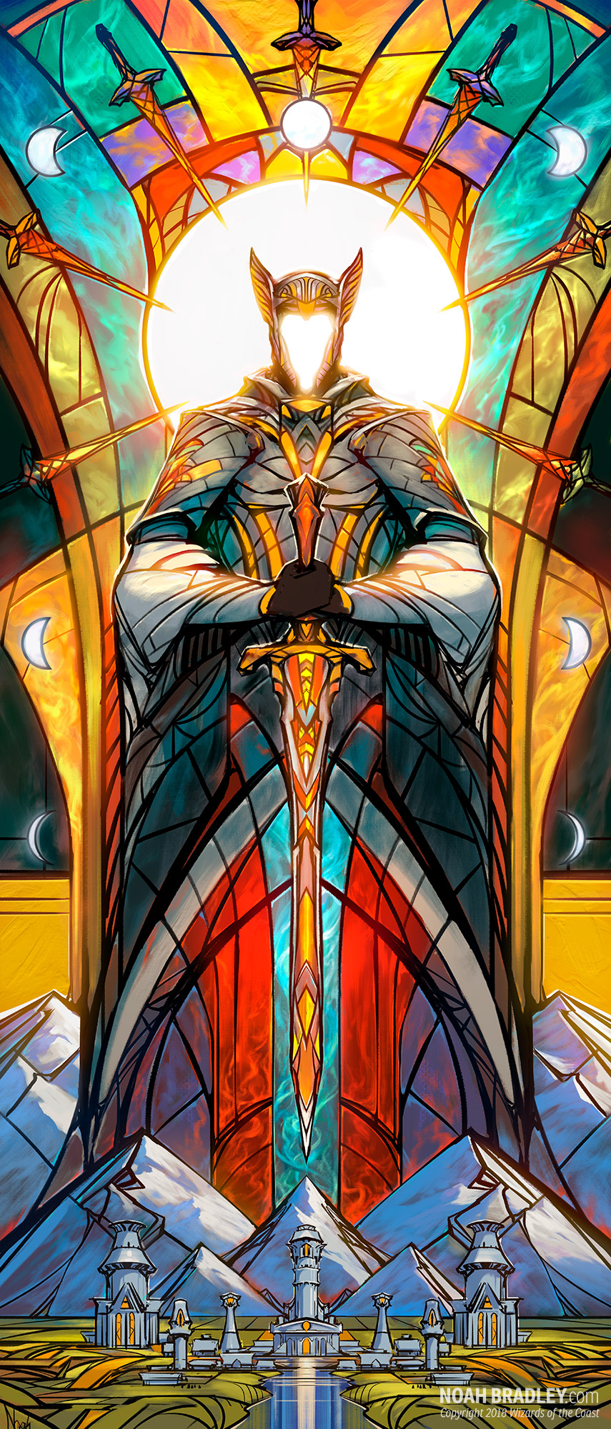
Kelly set up a series of recurring meetings where we would look at every piece of art we could find based on keywords, Benalish/Benalia/Capashen for example. We used this time to try to determine some visual hooks we could use from older art in the newer work so there would be some visual follow through to maintain a sense of continuity. The meetings were great to see what we found mutually exciting. Honestly, old Magic stuff was all over the place. We ended up making some arbitrary decisions. The Serran circle symbol, for instance, was something that we saw in a card or two but it was actually all over one of the older world guides. It was simple and we found it very usable. It was during these meetings that Benalish stained glass became a thing, which was just looking at the cards New Benalia and Capashen Standard. I thought it would be cool if stained glass armor was a thing and I described a scene of a steel sword shattering against a stained glass shield. Kelly then found uses for stained glass to depict the deeds of legendary Benalish heroes, which of course supported the theme of history.
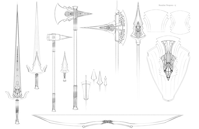
Benalish weapons concepts by Tyler Jacobson
Most of the cultures were already pretty well-defined, and we just needed plenty of material on them, like the Ghitu of Shiv. Some needed some fresh updating like the Keldons. Others needed to be more tightly unified visually like the Tolarians. Kelly, Tyler, and I got to a place where we understood the areas that were more and less clearly defined.
We did that exercise for all the cultures, capturing whatever consistent motifs we saw. The hope was that when fans saw those consistent things they would think to themselves, "This is the Dominaria I remember!" even if we did a lot of radical redesigns adjacent to it. We had to find a balance between respecting the efforts of previous creative teams and being able to do work that we found engaging. There was a deep respect for the previous work. We wanted that to show without allowing ourselves to be creatively hamstrung. We needed to give ourselves the space to do new and interesting work.
We ended up treating Dominaria with a lot of reverence, which was important to not get run out of town by longtime fans. That being said, the set in general was taking itself very, very seriously. It all felt very heavy. I found I was wanting opportunities to offset the weight of Dominaria with some levity.
I typically hate the color black in Magic. Generally, it's full of gross monsters with fangs and claws and is dripping goo in swamps. That can only be appealing to a small slice of the population. I wanted to do something different in this space. I love the work of Mike Mignola and Miyazaki. Both artists have a knack of making the spooky loveable and full of character. I told Jeremy Jarvis and Kelly that I wanted Urborg to be Mignola meets Miyazaki, and I'm not sure either of them knew what I meant. I don't think the artists who designed them did either. It would turn out to be one of more difficult things to pull off. It was a risky endeavor, but it was important to me and my goals with how the card set as a whole looked and felt. Kelly put his faith in me and I was determined to make it work. Along with Urborg for added levity, Kelly also suggested a more anthropomorphic thallid—a sort of shepherd of saprolings. I loved the idea as another opportunity to do something new and fun.
Six months in and we were rapidly approaching the Concept Push. A few weeks prior to the push, I asked Filipe Burburan to design a few pages of stained glass and Llanowar tattoos. The intent was to save our concept artists valuable time by giving them material they could quickly copy & paste into their own work and not get hung up on during the push. I was all about min-maxing. There was a lot to get through and I was worried we wouldn't hit our targets.
The Concept Push
Most concept push documents were a few pages printed front and back and stapled. Dominaria's was sixty-five pages, spiral bound.
For the Concept Push, we invited Clint Cearly, Steven Belledin, Vince Proce, Christine Choi, Jonas De Ro, Kieran Yanner and Chris Rahn. Over the course of the next several weeks I embraced not being Jeremy Jarvis.
Jeremy is as close to a genius as I think I've met in my life. It's not that he knows lots of stuff or is good at math or anything like that, but he is wildly intuitive and very, very clever. I am none of those things. During Jeremy's concept pushes he would have the artists print out what they were working on and tack it to a large wall, then he would comment on it with the entire group present. There would be dozens of pictures and he would methodically go across the wall and start commenting on the artwork, making brilliant comments along the way. It was supernatural to me how rapidly his mind worked.
I couldn't pretend to be able to do that. So I chose not to do it exactly the way Jeremy did it. It was a small insignificant change, really. I simply had the artists put their work on the wall at the end of the day and I would review it with them the following morning. In that way, I would have the time I'd need to process the work and find the words to communicate my intentions with clarity. It was a small change, but it was really my first tiny step towards art directing in my own way.
I was trained by Jeremy, and all the processes for creating art were put into place by him. Magic is a well-oiled art-making machine because of him, so any change to his methods was potentially problematic. He has already shown me the way, but in the end, he is a different person than I am. At times I had to make some choices that were mine alone. If I were to take a misstep, the problems were also mine alone.
Dominaria presented a unique problem—we were bringing together a bunch of disparate cultures from different sets that weren't at all related to each other. As a consequence, Dominaria was by its very nature going to be much looser conceptually than Theros or Amonkhet. I had to manage how diverse we let the world get before things started to look like they didn't belong together. I had to be okay with how thin the connective tissue would be, but at the same time ensure it was there or Dominaria would end up looking like a hodge-podge core set. That ended up being the bulk of the work I did. The artists focused on making cool characters and settings while I looked for visual metaphors and elements that could broadly tie different cultures together in interesting ways.
The concept push was great. I feel like each artist had a sizeable impact on the setting—things each person could take ownership of. During a concept push, I am never interested in a sexy drawing or painting. I only want to get to the realization of a great idea. Cabal banners in the form of Belzenlock markings? Sweet. Vodalian merfolk wizards that share the same mantle shape as Tolarian wizards? Visual language doesn't need to make canonical sense to be awesome. Some examples of artists doing defining stuff:
- Chris Rahn took the notion of "red reforges the past" quite literally. He sheepishly presented the Keldons dressed in leather that resembles an armorer's apron. I LOVED THAT. He is also very responsible for the looks of stained glass armor, the angels of Serra, and the Llanowar elves.
- Jonas DeRo did stunning landscape after landscape. He helped to realize the notion of history as the very landscape of the world. Also merfolk.
- Steven Belledin nailed the thallids. Equal parts beautiful, gross, and able to garden. There would be no Slimefoot without Steve.
- Vince Proce solidified the approach to the Cabal, making them scary, brutal and creepy. The Cabal polo-hammer-of-doom is all Vince.
- Clint Cearly nailed the architecture of Benalia and Serra. He also solved for all the Tolarian costuming and gave us floating books on chains.
- Christine Choi was chiefly responsible for our Urborg spirits, giving them the charm and creepiness that they needed, and also the Serran clerics and Llanowar elves.
- Kieran was largely responsible for the look of all the artifacts in the set that related to Thran and Urzan tech. Stuff that felt like old-school Magic but sits well with the current aesthetic.
- Tyler Jacobson was responsible for way too much to list. He touched just about everything. The Weatherlight, the Cabal, merfolk, djinn, Benalia, Serra, Urborg, etc. He's the one who built the world guide, and Dominaria wouldn't be what it is without his talents.
Each artist did way, way more than I could possibly list, these are merely some highlights.
At the halfway point, I still wasn't QUITE happy with Benalia. Sure, the stained glass thing was cool and we used Gerrard's X-shaped sashes, but it still lacked some unifying shape language. All the knights looked random except for the stained glass. After work hours, Tyler and I jammed on some shapes and came up with this:
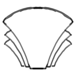
Benalish shape concept by Tyler Jacobson

Benalish hero shots by Tyler Jacobson
It speaks to Benalish idealism. The sense of blossoming renewal. The stretching to the heavens where the Serrans reside. Happy with that, we applied that shape language to the suite of Benalish things.
After the Concept Push ended, Tyler began the herculean task of honing the work done, making it tighter and even more cohesive and filling in any holes not covered during the push.
After the Concept Push
In Opt, the globe being held features a crack and
a missing chunk where Zhalfir should be.
Concept art by Tyler Jacobson
There was a recurring meeting where various members of R&D would gather weekly with the goal of helping the marketing team understand our intentions with creative for the set. Believe it or not, "History World" just didn't light anyone's fires. That's about the time Liz Leo suggested things like "Magic Comes Home" and I (for the record, I stand by this) was the first to say "A World of LEGEND." "But Mark," they said, "there's too much mechanical baggage," they said. Disclaimer: I didn't actually have anything to do with legends as a theme (I just called it is all.) We had the themes of Deep History, Vibrant Renewal and High Fantasy but those still didn't paint good pictures for people. Aaron Forsythe liked the theme of "Getting the band back together" as a sort of template. We were already working in that direction, but the words really helped solidify that intention. Kelly and I worked with Tyler on a few tone plates that could be shared with the marketing teams. The three pieces he created ended up becoming card art for Board the Weatherlight, Opt, and Dark Bargain. Those paintings did incredible work getting everyone on the same page with the mood we were aiming for and showing new characters and old getting together.
Wanting to do Something Different with Magic Art
Wherein Mark talks about homogeneity in Magic's art.
We've all heard the talk about how homogeneous Magic's art has been for a while. I've never agreed with that criticism. You can't look at Volkan Baga, Chris Rallis, and Seb McKinnon and think they're that similar. It's never made sense to me, but I wanted to find ways to dig into the core of the issue and solve for it instead of dismissing it outright—at least as best I could. What I decided to do is look for opportunities to broaden the artwork on the cards in content, style, and visual density. Let's be honest, Chase Stone couldn't be farther from Terese Nielsen style-wise. They are both exceptional and they both are trying to accomplish different things artistically, but if they are both painting Chandra in a desert blasting an Eternal with fire bolts (just as an example), then it does get a bit more same-y. I wanted to help solve for that.
With Dominaria, I wanted to find opportunities to have art descriptions that aren't a bunch of Planeswalkers pew-pewing baddies on card after card. I've always found that a bit juvenile anyways. Sometimes it's fun to see Gideon punch a baddie in the face, as long as it's a one-off and feels special in some way. I wanted more interesting ways of showing spells and effects that reminded me of old-school Magic. Allowing the pictures to not always be literal depictions of spells happening, to allow more interpretive images of those effects, a la the more recent Doomsday or Quinton Hoover's Regeneration. The entire set didn't need to reflect that, but I felt like if we could lean more into that space, that people would respond well to it. Of course, Kelly was the creative lead and the art descriptions largely came out of his head, but we had a unity of vision as far as all of this went. Honestly, there were only a couple times I recall pushing Kelly away from the pew-pew stuff.
Of course, I already had Urborg spirits and the thallids to add some levity and charm to the set. They would be kinda human-shaped without having to be the bad-ass-butt-kicker-types that are dense in Magic. Fans of Magic enjoy the goofy and off-brand stuff, so I wanted to try and give them that space to enjoy Magic in the ways they wanted to. We didn't give them squirrels, but I hoped they would appreciate the lengths we made to make them feel included in their game.
The final part of puzzle for me was:
Sagas & Legendary Sorceries
One of the challenges with Dominaria and its history was dealing with the potential confusion for the fans having images of Freyalise and Urza alongside Gideon and Liliana. I wanted to keep the current stories separate from depictions of events and characters from Dominaria's past—something really easy to do with words, but it presented a challenge in picture-form. We determined pretty early on that a distinction had to be drawn between current characters and stories and the events of the past.
The standing thought on legendary sorceries were that they were the sepia-toned vignette versions of historic scenes. Honestly. Faux-vintage western-era photos like the kind you'd get at a carnival was the running idea for a little too long. We even went so far as to consider making the frame of the art box more like a picture frame you see on a wall. Gross. I needed something smarter and more nuanced than that initial awful idea.
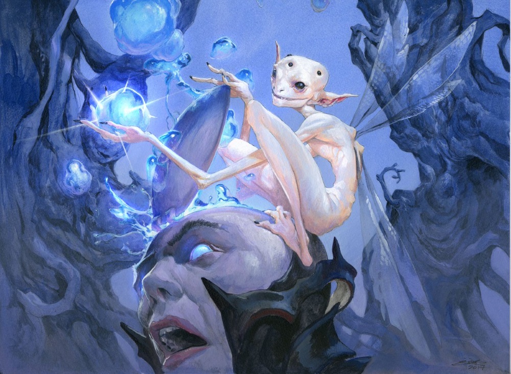
Art directors have a tendency to see and track large volumes of art. We'll follow a young artist's career over the course of years, able to sequence their progress and track the changes in style and competency. I describe this trait only because I had been watching Noah Bradley develop his Sin of Man IP since the beginning. It's not like I bookmarked his website or anything, but I mentally noted what he was doing without any desire to do anything with the information. It was just sitting there in my brain. Noah was primarily a landscape painter, but he was experimenting in different ways that I found compelling. It was all stuff that Magic could never ever use, but the style exploration was interesting to me.
When I commissioned Noah to paint Doomsday for Masters 25, I basically told him, "Bad things are happening to a figure. Make five of something matter. Make the image compelling. Just be the most Noah-y Noah you can. Go." What he came up with was perfect. Its an interesting image that looks great in the frame and on the table. No one would be confused by what an opponent was playing when that card landed on the battlefield.
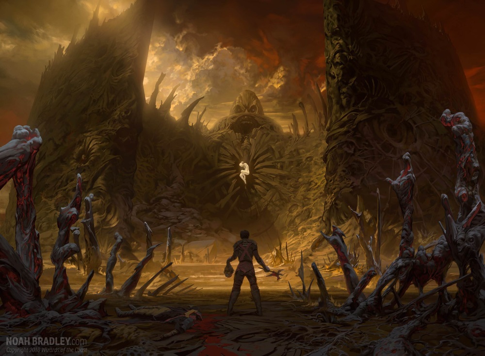
I shared Noah's almost surrealistic work with Kelly with an eye towards solving for the legendary sorceries. I really wanted them to be visually arresting in the way that Doomsday was, except they'd show Urza and Karn and Jaya. Kelly was on board, but probably pretty reluctantly. This cycle of cards were hugely important for the set. They were probably going to impact standard, see lots of coverage, featured characters fans wanted to see, and had to stand out from normal sorceries in some way. I have to admit I felt considerable pressure surrounding these cards and I gave them all to a single artist. That was a sizeable gamble on my part and I admit I was sweating it. I knew it was a fine idea and if it worked out in the way that I imagined we would end up with something unique. But man, there were a lot of "ifs" attached to them.
But Noah knocked them out of the park. They are visually interesting. They look different than a normal Magic card, and I don't know what they would've been if I hadn't watched Noah off creating his own worlds in his spare time.
Sagas were a unique challenge. I saw an early prototype created by Richard Garfield:
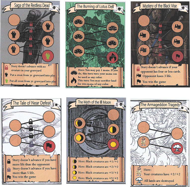
I knew from experience that it wouldn't be something I'd be able to commission. There were graphical elements that overlapped the artwork and, if I were to do my job correctly, those elements would be incorporated into the artwork somehow. Imagine a map or a tarot card where you could track your progress via indicators within the art. The problem is that the design team didn't know how many chapters the Sagas would have, making them impossible to commission without bankrupting Wizards of the Coast with revision fees. So we had to separate the art from the chapter track/text box. It took a while before we landed on the vertical art box, and I was against it for the longest time. Commissioning vertical images that tell a story is...unnatural. It's the opposite of widescreen or letterbox movie. I wanted to avoid literal depictions of scenes with characters trying to interact in a tall, thin art box. Besides, I was avoiding representational depictions in general. We ended up on a slightly non-representational image depicted in stained glass. It made for an odd image for an odd card. Kelly and I did the responsible thing, and I commissioned an example piece of art as a proof of concept which of course ended up being History of Benalia. After that came in and looked great we had to figure out what else to do.
Kelly and I often met as the Saga's card file was being settled, and we doodled ideas on whiteboards for card concepts. Some of them came to us easier than others, but all of them made for wildly unique takes on what Magic art was. I found the idea of making wildly divergent art exciting and terrifying. I thought it was super cool. Kelly thought it was super cool. But would fans respond well to them? Would they even consider them Magic cards? All we could do was our best.
Commissioning the Set
Card commissioning begins with top lining the cards, getting the art descriptions written, and then assigning the artists, followed by sweating it out.
Doug Beyer has a great article on what top-lining is. The short of it is that the creative team gets together and looks at what amounts to be a pile of math that makes up the mechanics of of card. The smart members of the team know from experience what those things mean. Kelly is really, really good at top-lining. I threw in a few ideas here and there, but I was mostly a sounding board for Kelly—someone to bounce ideas off of and perhaps someone who simply made a sour face when hearing an idea that didn't excite. Here's what I did during top-lining: I started to immediately assign as many artists as I could. If I didn't picture an artist when discussing the concept, I wanted to push it more. I either wanted it to be more interesting or more open to artistic interpretation so that favorite artists of mine could do their own thing with the art. It didn't always pan out, so what I ended up doing was printing out every art description that was in the system and taking them home with me. I read them all over and over until a notion came to me—not a specific image, but something more like the mood I wanted to evoke. Each card feels a little different when it lands on the table. Playing Merfolk Trickster should look and feel different than playing History of Benalia, and the artwork, where possible, should reflect that. What I didn't want was to have an ultra specific image in my head that I wanted someone to realize for me, exactly like I imagined it. That's no fun for anyone.
I wanted, more than anything, to avoid commissioning any ol' piece to a competent artist. I wanted to cater as many pieces to specific people as I could. I wanted to increase the hit ratio of paintings that artists could make prints and playmats of—art that they could be proud of having painted. That was the goal anyway, and when commissioning the art I sent personalized notes to as many artists as I could telling them why I sent them the commission, what it was about their work that appealed to me and why I wanted them to be partners in making the art. I did my best to play to each artist's unique strengths and lobbed them assignments so that they could utterly smash them. I'm not sure how successful the artist pool feels that was. I never asked, but even if things were 10% better for them on that front I'd be satisfied.
Magic commissions in multiple waves. A large set will be broken up into 2-3 waves of art consisting of 150-ish pieces per wave. After the first wave, I printed out all the art and laid them out on a large conference room table so that we could judge the card set as a whole. This made it so any changes necessary could be made in the second wave. Two things struck us in that review: Because of the approach with legends it felt like Dominaria was Portrait World—a bunch of characters just standing around looking kewl; White was boring as crap. Tolarians were getting into wizard-y antics, red had goblins, green had thallids, and black had Urborg spirts. White just had a stick up their butts. Kelly and I looked for a few opportunities to add a little fun to white; it wasn't much but just enough that it wasn't the odd one out. We also tracked sketches on some of the legends as they came in to make sure we were getting a bit more variety.
Leaving Wizards
I scheduled my exit from the company after Dominaria was set to be wrapped. Typesetting wasn't quite done yet, still waiting on flavor text, but I have very little to do with that. All of R&D gets together and does a slideshow of the entire set, making any last minute comments to get changes in before being sent off for production. I wasn't able to make it to the slideshow, which broke my heart a bit.
I'm proud of the work that we all did on Dominaria. I want to thank my friends at Wizards of the Coast for entrusting this effort to me. We all loved doing it and poured ourselves into it. It was a singular pleasure to have been a part of it. I hope it shows.
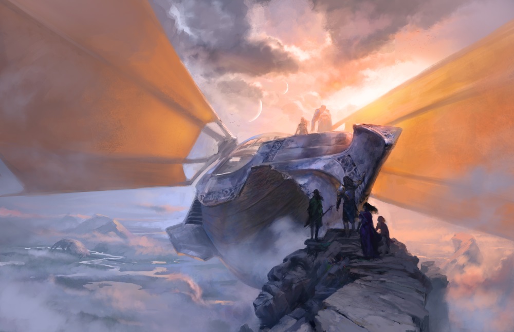 Weatherlight concept art by Tyler Jacobson
-
View User Profile
-
Send Message
Posted May 12, 2018-
View User Profile
-
Send Message
Posted May 11, 2018-
View User Profile
-
Send Message
Posted May 9, 2018-
View User Profile
-
Send Message
Posted May 9, 2018Though I am a little sad that after Kelly Digges, I see that another man highly responsible for the gem that is Dominaria left Wizards.
-
View User Profile
-
Send Message
Posted May 8, 2018-
View User Profile
-
Send Message
Posted May 8, 2018-
View User Profile
-
Send Message
Posted May 7, 2018-
View User Profile
-
Send Message
Posted May 7, 2018