This article is all about the art of Dissension. Like every magic set, Dissension has its good art, its bad art, and its horrendous art. It also heralds the return of the controversial Rebecca Guay with her first original art since Elvish Piper in 9th Edition. I'm going to tell you which cards I like, which cards I hate, and which cards I love. Let's get to it!
The Good
What can I say? I'm a sucker for flame effects. When done well they can be extremely effective. Here's a list of some of the art in Dissension that makes good use of flames:
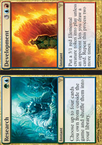
Demonfire, Flame-Kin War Scout, Flaring Flame-Kin, Rakdos Guildmage, Rakdos the Defiler, Research & Development
Two of these cards are especially well done. Flaring Flame-Kin not only has great flame effects but also a great sense of motion that really helps to indicate the trampling effect the Flame-Kin can have. I really like what Brian Hagan has done with this card.
Oooooh...Flamey
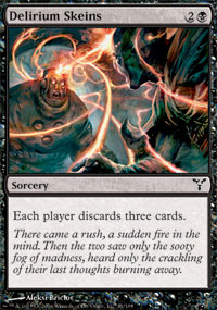
Another set of cards I like are ones that have interesting light effects. Some examples of these cards are Blessing of The Nephilim, Elemental Resonance, Swift Silence, and Rix Maadi. My two favourite pieces of art that make good use of interesting light effects are the Skeins: Delirium Skeins and Vision Skeins.
What was I saying?
There are two more pieces of art I would like to mention specifically at this point. These two pieces are Aquastrand Spider and Pure & Simple. Both have great art, but for different reasons. Aquastrand Spider is simply a beautiful card. It may be the best art on any spider in Magic. The web is beatifully drawn, and the small droplets of water dripping from both the spider and the web are extremely realistic. And the spider legs as so long and spindly and creepy. The background is fairly unimpressive, but that just centres the focus of the piece back on the spider.
The art pieces for Pure and Simple are nothing special seperately. They are decent pieces of art, but they're nothing special. What I really like about these pieces is how they do something that hasn't been done before. One of my pet peeves is how on split card the two pieces of art never have any interaction. On this card the two pieces of art mirror each other. I really like how Parente uses the same pose to demonstrate two very different situations. In one, the victorious barbarian who has just defeated a mighty monster; in the other, a peaceful dryad has just cast a cleansing spell. Yet both have their arms raised in the exact same way. This sort of parallel art is something that can only be achieved on split cards, and I really like it when an artist does something new and innovative like that.
The Bad
Here's the part every critic truly enjoys. Looking at somebody else's painstaking work, and then tearing it to pieces. Well, let's get to it!
Kev Walker, what were you thinking? You were doing so well! All of your card art was either good or great. And then you drop this bomb on us:
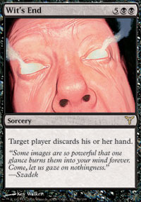
I HATE the art on Wit's End. With a passion. First of all, there is far too much of the art devoted to the ugly pasty face of what I assume to be an elderly man. Then there is the fact that it is extremely jarring when on the background of a black card. The background of the art is plain black, with absolutely nothing having done with it, the face has no details upon it (except the wrinkles), and the smoke effects are quite lame. The art simply looks completely unfinished. Maybe it was that he had too many cards to complete for a small set like Dissension and ran out of time and submitted what he had completed to be the card art. This would be unfortunate, but it would help explain the huge difference between the weakness of this piece of art and the general strength of Kev's work.
Remember Nettling Imp? And Norrit? Well they're back. Or at least their ugly little brother is. Introducing Demon's Jester:
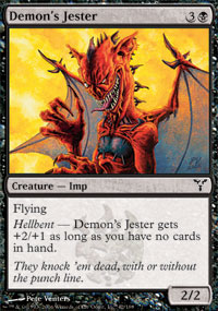
He's one of a kind
The final piece of art I will be ripping a new one in this section is Lyzolda, The Blood Witch. Lyzolda, Lyzolda, Lyzolda. Such an interesting card, with such uninteresting artwork. The piece has no emotion or movement; it is totally static. She is supposed to be performing some sort of weird Rakdos rite, but instead it just looks like she's having a shower of magma. And what's with the squid on her head? Here's a message to all Magic artists: Just drawing a hot chick isn't enough to make a good piece of art.
The Guay
There are two camps when it comes to Rebecca Guay art. You either love her and everything she does, or you hate absolutely every piece she's ever submitted. I fall into neither. I don't hate her style of painting, but I don't love it either. I try to look at each piece and judge it on its own merits.
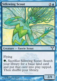
Guay illustrated three cards in Dissension: Pride of the Clouds, Freewind Equenaut, and Silkwing Scout. First up is the Pride. It is the perfect card to present a problem that many people have with Guay's art. The creature really doesn't seem like the badass beatdown creature it seems to be when you look at the art. Instead it is a pride of lions with freakishly long hair. Now Guay's art has its place. I love such classics as Angelic Page and Gaea's Blessing, but on an agressive card like Pride of the Clouds it just doesn't seem to fit. There's nothing especially wrong with the art; it's just out of place.
Next is Freewind Equenaut. You'd think my problems with the last card would transfer to this one. It as after all a 2/2 flyer for 3 with an additional ability, and therefore an aggresively costed creature. However what didn't work on the Pride works very well on the Equenaut. The Equenaut's long flowing hair doesn't seem silly like the Lions, while the horses dark colouring allows it to seem menacing and beautiful at the same time. This piece proves that just because Guay's art is feminine does not mean it can't work an agressively costed creature.
Crayola paid her an endorsement fee
And The Awesome
Now to end this article on a good note. In my humble opinion, the two best pieces of art in Dissension are Voidslime and Windreaver. I don't feel like dissecting why exactly why I like these two cards, as they pretty much speak for themselves.
Overrall I feel that Dissension had a plethora of good art. And a set full of good art with a few exceptions is far better than the alternative (7th Edition).
I hope you enjoyed the article and didn't disagree with too many of my opinions. See you again in Coldsnap.
-
View User Profile
-
Send Message
Posted Feb 20, 2014Oh my you are so right about the art on the Silkwing scout! i was SUCH the wrong person to do this card- and never had any idea how to do this character well- in the hundreds of cards ive done this is one of my least favorite- as well as two or three others form this set- no connection to any of this character design Im afraid.
i think i made up for it with spellstutter sprite though later- she's a favorite of mine!
And even though the card is powerful- Dark Ritual should NEVER been assigned to me- the description what something i should have turned it down- but didnt realize until i was well into the job that the description of the actions just were outside my skill set! apologies guys. Bad artist no doughnut.
that being said i think the balance of the cards ive done probably 130 of the 140odd or so of them i am so super proud of-( and eEVERYONE who's done as many cards as i have has a few tankers in their career- for whatever reason!)
anyhow- on another note-
i wanted to let folks know that i have a kickstarter running now for my first comprehensive art of book (that will absolutely not have silkwing scout in it!)- it will feature some of my favorite images like Channel and Regenerate and Dwell on the past and Angelic renewal as well as path to exile and lace with moonglove and some more favorites of mine.I can only put a percentage of MTG contractually within the book- and the rest will be comics and book cover and recent gallery work- but all my best stuff from the last 22 years will be in it.
I know not all of this sites followers are fans of mine- but those who are might be interested in pre ordering the book as this is the only place online that it will be available!
yours with affection- Rebecca
https://www.kickstarter.com/projects/1360132117/evolution-the-art-of-rebecca-guay-1993-2014